


Contents
01
Brand Strategy

1a
Tone & Voice
Like the perfect playlist, our tone adapts to the rhythm of the room. Professional when it matters, light-hearted when it’s right. Through it all, our genuine spirit shines, keeping it real with every interaction.
Our Vision: why we exist
At Nimbl, we envision a future where technology intuitively fits into every moment. Grounded in empathy, we're not just innovators but enablers, enhancing every experience one interaction at a time.
Our Mission: what we do
We combine the human element with the right technology to solve our clients’ business challenges.
What do we mean about the human element?
- Start everything with deep understanding & empathy
- Design with a human-centered approach
- Build what people need and can maintain
- Optimize with the right mixture of digital excellence and human input
- Attract and grow a community of innovative problem solvers
Our Promise: how we help
We combine human-centered design, technology, and industry expertise to create compelling and meaningful experiences to help your business grow.
1b
Sample Copy
3a
Primary Lockup


3b
Clearspace

3c
Logo

3c
Wordmark

3d
Incorrect Usage


Do not resize the mark


Do not rotate the logo

Mark color should match wordmark or nimblue


Do not outline the logo
Do not reverse the lockup

Do not add gradients the logo
3e
Partnerships
3a
Primary Palette
Blue
Hex: #1593E8
Night
Hex: #051923
Bleach
Hex: #000000
Carbon
Hex: #778DA9
05
Typography
Nimbl's typography system reflects how we think about communication: clear, accessible, and authentically human.
Primary Sans-Serif (Helvetica Now)
Our primary typeface is a clean sans serif chosen for maximum readability across every platform and context. It's the workhorse that carries our ideas with clarity and confidence, whether we're presenting complex strategies or explaining simple solutions.
Secondary Accent (Shadows into Light)
When we want to add warmth and show our human side, we use a handwritten accent font that feels personal without being precious. This pairing captures who we are: professional problem-solvers who never forget that real people are on the receiving end of everything we create.
Together, these fonts create a system that adapts to every situation while staying true to our core belief that good communication starts with understanding your audience. Clear thinking deserves clear typography, and that's exactly what this system delivers.
06
Art Direction
Nimbl’s photography style reinforces our brand’s core values (trust, clarity, and warmth) by showcasing visuals that reflect professionalism, accuracy, and control.

Clean & Casual
Photography should feature modern, well-lit workspaces with a clean and organized feel. The focus should be on clarit, avoiding clutter or overly dramatic compositions.

Subtle Technology Integration
Photography should include elements of financial technology—computer screens displaying dashboards, tablets with data analytics, or hands interacting with financial tools—to highlight Redo’s tech-driven approach to error correction.

Financial Storytelling
Images should capture real-world financial scenarios—professionals analyzing reports, business owners reviewing balance sheets, and teams discussing financial strategies. This reinforces Redo’s role in helping businesses take control of their finances.

People with Confidence & Focus
Images should capture real-world financial scenarios—professionals analyzing reports, business owners reviewing balance sheets, and teams discussing financial strategies. This reinforces Redo’s role in helping businesses take control of their finances.


Brand Guidelines
Our brand isn't just a logo; it's an experience. It's how we connect, inspire, and differentiate.
This guide is your go-to toolkit for making Nimbl resonate with every click, every word, and every interaction. From strategy, tone of voice, color, typography, imagery, illustration, iconography and logo usage, utilize this guide to ensure every message we create consistently embodies the spirit and style of Nimbl.
Contents
01
Brand Strategy
02
Personality
03
Logo
04
Color
05
Typography
06
Art Direction
01
Brand Strategy
02
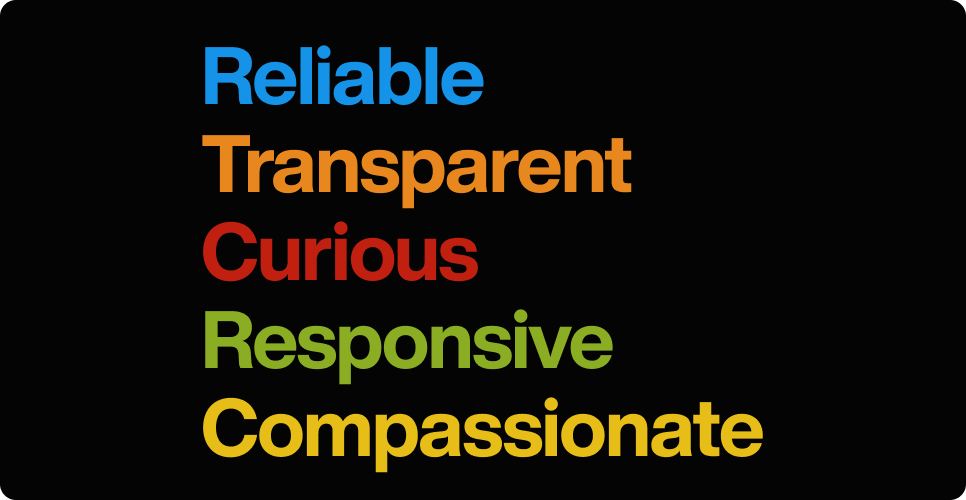
Personality
Imagine Nimbl as your go-to guru – smart, reliable, yet always approachable. We're the folks who translate tech-speak into real talk. Authenticity is our north star, guiding every message we craft.
2a
Tone & Voice
Like the perfect playlist, our tone adapts to the rhythm of the room. Professional when it matters, light-hearted when it’s right. Through it all, our genuine spirit shines, keeping it real with every interaction.
Our Vision: why we exist
At Nimbl, we envision a future where technology intuitively fits into every moment. Grounded in empathy, we're not just innovators but enablers, enhancing every experience one interaction at a time.
Our Mission: what we do
We combine the human element with the right technology to solve our clients’ business challenges.
What do we mean about the human element?
- Start everything with deep understanding & empathy
- Design with a human-centered approach
- Build what people need and can maintain
- Optimize with the right mixture of digital excellence and human input
- Attract and grow a community of innovative problem solvers
Our Promise: how we help
We combine human-centered design, technology, and industry expertise to create compelling and meaningful experiences to help your business grow.
2b
Sample Copy
Your Finances, Fixed the Right Way
Precision matters when it comes to financial corrections. A small error can have a big impact on your savings, credit score, or future financial goals.
We Handle the Fix, You Focus on What Matters
Your time is valuable, and dealing with financial errors shouldn’t take up more of it than necessary. Whether it’s an unexpected overdraft fee or a billing mistake, we take care of the correction process for you.
Mistakes Don’t Have to Cost You—We’ve Got Your Back
An overlooked charge or a simple accounting mistake shouldn’t throw off your financial plans. We step in to identify and correct these issues before they become bigger problems.
See an Error? We’ll Make It Right.
Not sure what that unexpected charge is? Worried about an incorrect withdrawal? Instead of worrying or assuming the worst, let us investigate and resolve the issue for you.
03
Logo
Our wordmark is more than visual identity. It's a thoughtful representation of who we are and where we're headed as human-centered problem solvers.
Evolved
This wordmark captures Nimbl's dynamic, evolving nature. It reflects our journey from where we started to where we're going, embodying our commitment to continuous growth and adaptation. Like the work we create, it's designed to move forward while staying grounded in our core values.
scalable
Built with practicality in mind, the flat baseline and bold weight ensure seamless application across every product and platform. Whether it's appearing on a business card or a digital billboard, the wordmark maintains its integrity and impact at any size. This scalability mirrors our approach to design: solutions that work beautifully at every touchpoint.
Human
The distinctive 'i' form serves as more than typography. It stands as a visual metaphor for Nimbl's human element, the empathy and understanding that drives every decision we make. Its sturdy construction also represents our capacity to hold weight when it matters most, supporting our clients through complex challenges with strength and reliability.
Together, these elements create a wordmark that tells our story: we're innovators who scale thoughtfully while keeping human connection at the center of everything we build.
3a
Primary Lockup


3b
Clearspace

3c
Logo

3d
Wordmark

3e
Incorrect Usage
Do not resize the mark
Do not rotate the logo
Mark color should match wordmark or nimblue
Do not outline the logo
Do not reverse the lockup
Do not add gradients the logo
3f
Partnerships
04
Color
Nimbl's color palette is designed to communicate with clarity.
Together, these colors create a trustworthy, empathetic, and forward-thinking brand identity, ensuring that Nimbl is instantly recognized as the go-to partner for meaningful design and technology solutions.
4a
Primary Palette
05
Typography
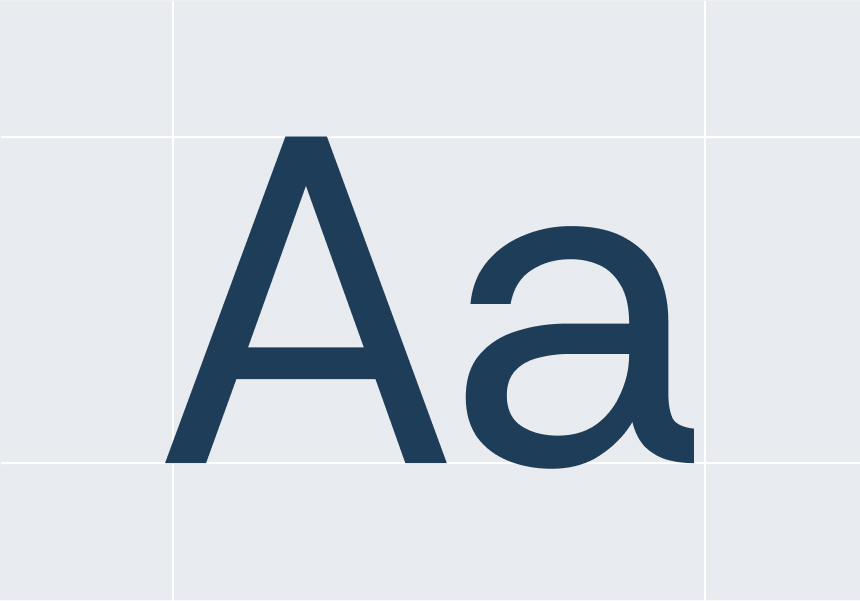
Nimbl's typography system reflects how we think about communication: clear, accessible, and authentically human.
Primary Sans-Serif (Helvetica Now)
Our primary typeface is a clean sans serif chosen for maximum readability across every platform and context. It's the workhorse that carries our ideas with clarity and confidence, whether we're presenting complex strategies or explaining simple solutions.
Secondary Accent (Shadows into Light)
When we want to add warmth and show our human side, we use a handwritten accent font that feels personal without being precious. This pairing captures who we are: professional problem-solvers who never forget that real people are on the receiving end of everything we create.
Together, these fonts create a system that adapts to every situation while staying true to our core belief that good communication starts with understanding your audience. Clear thinking deserves clear typography, and that's exactly what this system delivers.
5b
Sizing
Each font size range has been carefully calibrated to maintain legibility. These specifications should be applied consistently across all design applications, from digital interfaces to print materials.
Clear Up Confusion, Gain Peace of Mind
Type Sizes > 72pt/px
110% Leading
-2% Tracking
Whether it’s a bank error, an unauthorized charge, or an overlooked refund, we ensure you don’t pay for something you shouldn’t have.
Type Sizes 55–72pt/px
120% Leading
-2% Tracking
Our team works diligently to recover lost funds, correct inaccuracies, and keep your financial records accurate—so you can feel confident about every dollar in your account.
Type Sizes 24–55pt/px
120% Leading
-2% Tracking
Financial errors shouldn’t slow you down or cause unnecessary stress. Whether it’s an incorrect charge, a duplicate transaction, or a miscalculated fee, we step in to make things right. Our process is simple, straightforward, and designed to get your money back where it belongs—quickly and without hassle.
Type Sizes 0–24pt/px
150% Leading
-3% Tracking
06
Art Direction
Nimbl’s photography style reinforces our brand’s core values (trust, clarity, and warmth) by showcasing visuals that reflect professionalism, accuracy, and control.
Clean & Casual
Photography should feature modern, well-lit workspaces with a clean and organized feel. The focus should be on clarit, avoiding clutter or overly dramatic compositions.
Subtle Technology Integration
Photography should include elements of financial technology—computer screens displaying dashboards, tablets with data analytics, or hands interacting with financial tools—to highlight Redo’s tech-driven approach to error correction.
Financial Storytelling
Images should capture real-world financial scenarios—professionals analyzing reports, business owners reviewing balance sheets, and teams discussing financial strategies. This reinforces Redo’s role in helping businesses take control of their finances.
People with Confidence & Focus
Images should capture real-world financial scenarios—professionals analyzing reports, business owners reviewing balance sheets, and teams discussing financial strategies. This reinforces Redo’s role in helping businesses take control of their finances.


Brand Guidelines
Our brand isn't just a logo; it's an experience. It's how we connect, inspire, and differentiate.
This guide is your go-to toolkit for making Nimbl resonate with every click, every word, and every interaction. From strategy, tone of voice, color, typography, imagery, illustration, iconography and logo usage, utilize this guide to ensure every message we create consistently embodies the spirit and style of Nimbl.
Contents
01
Brand Strategy
02
Personality
03
Logo
04
Color
05
Typography
06
Art Direction
01
Brand Strategy
02
Personality
Imagine Nimbl as your go-to guru – smart, reliable, yet always approachable. We're the folks who translate tech-speak into real talk. Authenticity is our north star, guiding every message we craft.
1a
Tone & Voice
Like the perfect playlist, our tone adapts to the rhythm of the room. Professional when it matters, light-hearted when it’s right. Through it all, our genuine spirit shines, keeping it real with every interaction.
Our Vision: why we exist
At Nimbl, we envision a future where technology intuitively fits into every moment. Grounded in empathy, we're not just innovators but enablers, enhancing every experience one interaction at a time.
Our Mission: what we do
We combine the human element with the right technology to solve our clients’ business challenges.
What do we mean about the human element?
- Start everything with deep understanding & empathy
- Design with a human-centered approach
- Build what people need and can maintain
- Optimize with the right mixture of digital excellence and human input
- Attract and grow a community of innovative problem solvers
Our Promise: how we help
We combine human-centered design, technology, and industry expertise to create compelling and meaningful experiences to help your business grow.
1b
Sample Copy
Your Finances, Fixed the Right Way
Precision matters when it comes to financial corrections. A small error can have a big impact on your savings, credit score, or future financial goals.
We Handle the Fix, You Focus on What Matters
Your time is valuable, and dealing with financial errors shouldn’t take up more of it than necessary. Whether it’s an unexpected overdraft fee or a billing mistake, we take care of the correction process for you.
Mistakes Don’t Have to Cost You—We’ve Got Your Back
An overlooked charge or a simple accounting mistake shouldn’t throw off your financial plans. We step in to identify and correct these issues before they become bigger problems.
See an Error? We’ll Make It Right.
Not sure what that unexpected charge is? Worried about an incorrect withdrawal? Instead of worrying or assuming the worst, let us investigate and resolve the issue for you.
03
Logo
Our wordmark is more than visual identity. It's a thoughtful representation of who we are and where we're headed as human-centered problem solvers.
Evolved
This wordmark captures Nimbl's dynamic, evolving nature. It reflects our journey from where we started to where we're going, embodying our commitment to continuous growth and adaptation. Like the work we create, it's designed to move forward while staying grounded in our core values.
scalable
Built with practicality in mind, the flat baseline and bold weight ensure seamless application across every product and platform. Whether it's appearing on a business card or a digital billboard, the wordmark maintains its integrity and impact at any size. This scalability mirrors our approach to design: solutions that work beautifully at every touchpoint.
Human
The distinctive 'i' form serves as more than typography. It stands as a visual metaphor for Nimbl's human element, the empathy and understanding that drives every decision we make. Its sturdy construction also represents our capacity to hold weight when it matters most, supporting our clients through complex challenges with strength and reliability.
Together, these elements create a wordmark that tells our story: we're innovators who scale thoughtfully while keeping human connection at the center of everything we build.
3a
Primary Lockup


3b
Clearspace

3c
Logo
3c
Wordmark
3d
Incorrect Usage
Do not resize the mark
Do not rotate the logo
Mark color should match wordmark or nimblue
Do not outline the logo
Do not reverse the lockup
Do not add gradients the logo
3e
Partnerships
04
Color
Nimbl's color palette is designed to communicate with clarity.
Together, these colors create a trustworthy, empathetic, and forward-thinking brand identity, ensuring that Nimbl is instantly recognized as the go-to partner for meaningful design and technology solutions.
3a
Primary Palette
05
Typography
Nimbl's typography system reflects how we think about communication: clear, accessible, and authentically human.
Primary Sans-Serif (Helvetica Now)
Our primary typeface is a clean sans serif chosen for maximum readability across every platform and context. It's the workhorse that carries our ideas with clarity and confidence, whether we're presenting complex strategies or explaining simple solutions.
Secondary Accent (Shadows into Light)
When we want to add warmth and show our human side, we use a handwritten accent font that feels personal without being precious. This pairing captures who we are: professional problem-solvers who never forget that real people are on the receiving end of everything we create.
Together, these fonts create a system that adapts to every situation while staying true to our core belief that good communication starts with understanding your audience. Clear thinking deserves clear typography, and that's exactly what this system delivers.
5b
Sizing
Each font size range has been carefully calibrated to maintain legibility. These specifications should be applied consistently across all design applications, from digital interfaces to print materials.
Clear Up Confusion, Gain Peace of Mind
Type Sizes > 72pt/px
110% Leading
-2% Tracking
Whether it’s a bank error, an unauthorized charge, or an overlooked refund, we ensure you don’t pay for something you shouldn’t have.
Type Sizes 55–72pt/px
120% Leading
-2% Tracking
Our team works diligently to recover lost funds, correct inaccuracies, and keep your financial records accurate—so you can feel confident about every dollar in your account.
Type Sizes 24–55pt/px
120% Leading
-2% Tracking
Financial errors shouldn’t slow you down or cause unnecessary stress. Whether it’s an incorrect charge, a duplicate transaction, or a miscalculated fee, we step in to make things right. Our process is simple, straightforward, and designed to get your money back where it belongs—quickly and without hassle.
Type Sizes 0–24pt/px
150% Leading
-3% Tracking
06
Art Direction
Nimbl’s photography style reinforces our brand’s core values (trust, clarity, and warmth) by showcasing visuals that reflect professionalism, accuracy, and control.
Clean & Casual
Photography should feature modern, well-lit workspaces with a clean and organized feel. The focus should be on clarit, avoiding clutter or overly dramatic compositions.
Subtle Technology Integration
Photography should include elements of financial technology—computer screens displaying dashboards, tablets with data analytics, or hands interacting with financial tools—to highlight Redo’s tech-driven approach to error correction.
Financial Storytelling
Images should capture real-world financial scenarios—professionals analyzing reports, business owners reviewing balance sheets, and teams discussing financial strategies. This reinforces Redo’s role in helping businesses take control of their finances.
People with Confidence & Focus
Images should capture real-world financial scenarios—professionals analyzing reports, business owners reviewing balance sheets, and teams discussing financial strategies. This reinforces Redo’s role in helping businesses take control of their finances.